
Windows Performance Analyzer Dark Mode
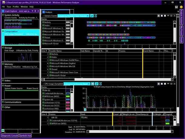
As a performance dev who mostly works on Windows, I spend a substantial amount of my time staring at Windows Performance Analyzer (WPA). It is a great tool for discovering performance issues once you get the hang of it. WPA has been around in some form for over a decade. During that time it’s user interface hasn’t changed much. It looks very much dated in the Vista/Win7 timeframe.
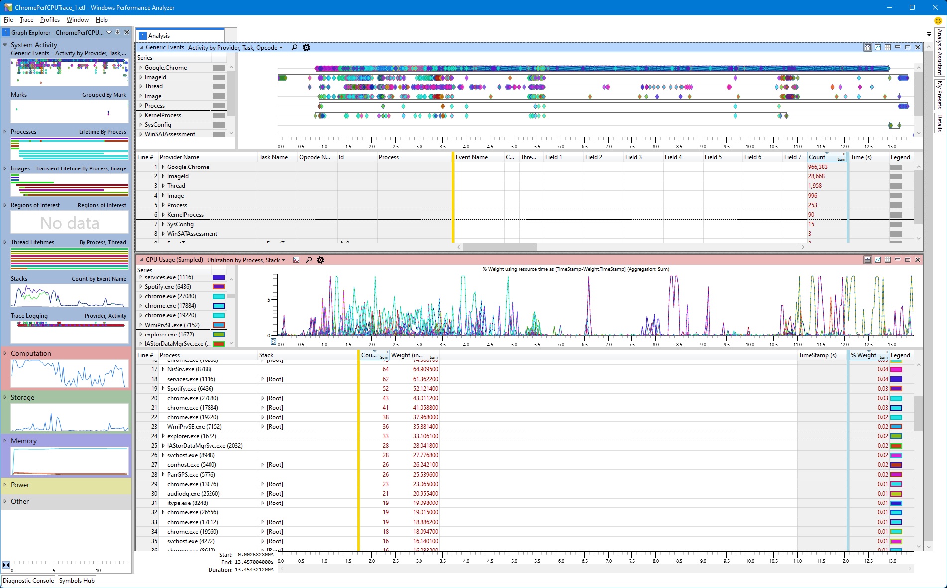
In January of 2021 I came down with shingles in my left eye. I attempted to do some performance investigations in WPA but the light UI was too bright for my sensitive eye. It was incredibly unconfortable. I tried switching to High Contrast Black, but that is just a terrible experience all together.
What I would have given at the time for a Dark Mode in WPA. After recovering I set out to add this. Turns out the WPA owners were extremely welcoming of an outside developer at Microsoft working in their codebase. What began as a short side-project turned into something more substantial than I initially anticipated. Along the way I fixed some other UI issues that had bothered me over the years. After a few months I was at a point where I put up a PR.
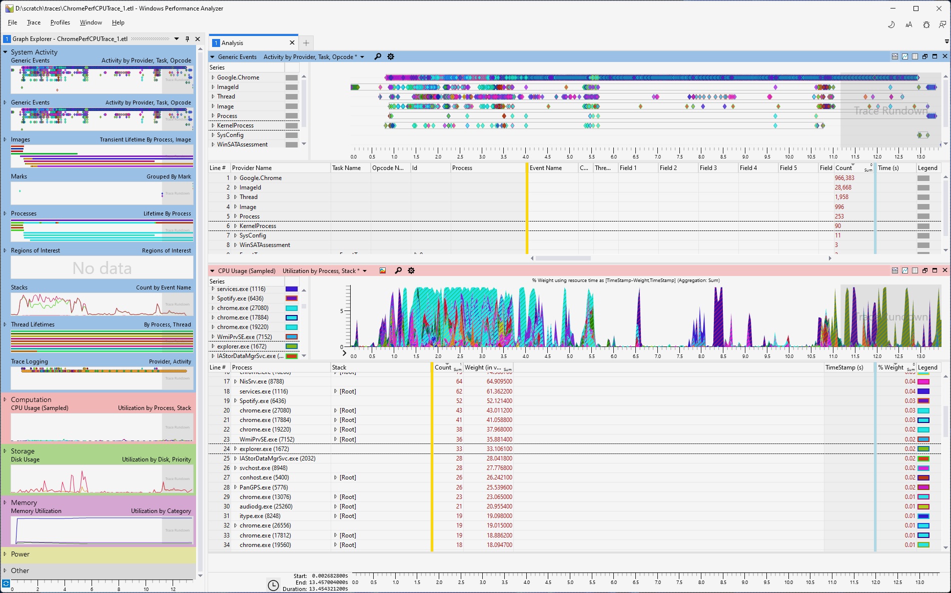
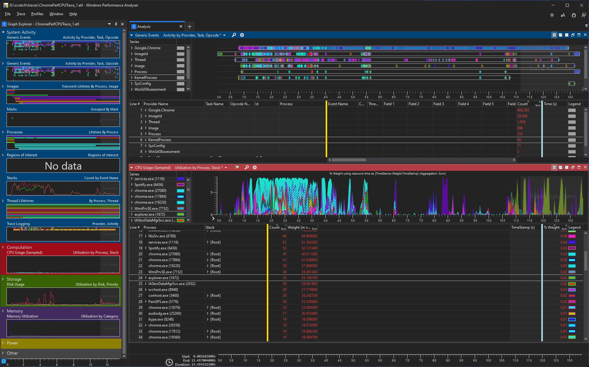
Changes
• Removed old Vista-era styling
• Replaced low-res PNG resources with font glyphs for better scaling on high DPI screens.
• Bad borders, margins, button sizes fixed
• Consistent themes
• Fixed high contrast issues
• Custom title bar area
• Light and Dark modes with appropriate text, foreground and background colors
• Consistent with other modern UI
Leave a comment